Role: Call for response volunteer
Problem: AT&T leadership requested examples and analysis of online transaction experiences.
Solution: I immediately thought of the contrast between my experiences in paying my two credit cards online and detailed why CapitalOne provides a cleaner, more effortless experience and feeling.
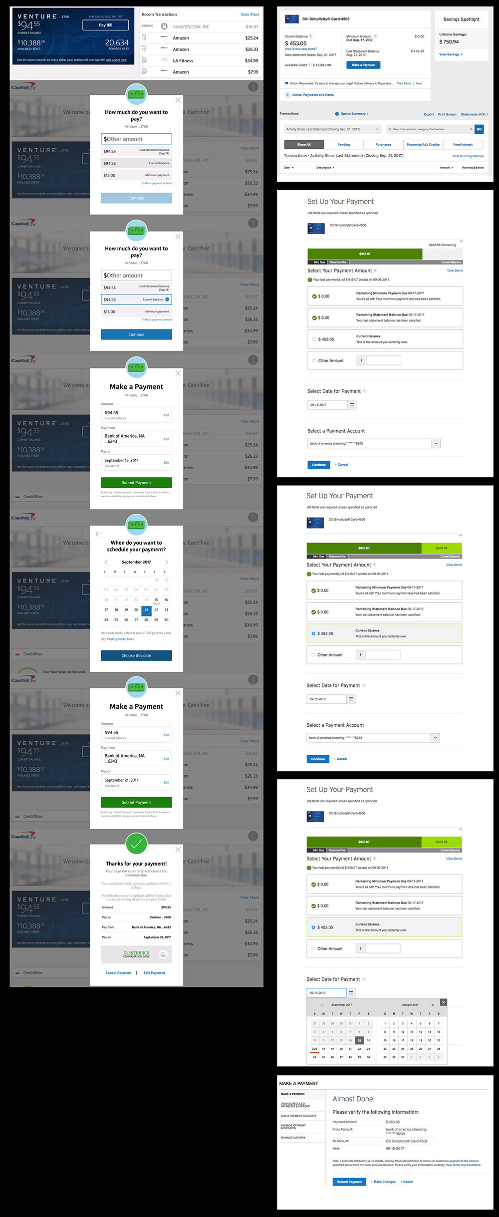
Screen comparison below.
Evaluation: CapitalOne online credit card payment:
• Payment flow contained in a short, narrow modal with a dimmed background provides a clear, focused progression of steps.
• Flow progresses through one consistent screen format
• Information relating to payment is focused and concise, with minimal verbiage
• Use of color / bold typography further emphasizes action, separates/focuses information
• Icons/color offer visual cues/indicators, feel intentional, like an app unto itself vs an auto-generated form
• Minimal calendar, compared with the wider Citi version: The Citi calendar affords next month without additional clicks, but minimal is better overall
• Noticeably painless, simple, bold, and colorful
• Sections posed in the form of a question, use of plain language:
Verbiage comparison: CapitalOne vs Citi: "How much do you want to pay?" vs. "Select your payment amount": CapitalOne offers a guiding question that invites users to identify from multiple choice vs. Citi's "Select", which is rigid and burdensome.
• "Make a payment" vs "Setup your payment": "make" connotes immediacy vs "setup" sounds like you'd better pack a lunch
• "Make a payment" vs "Setup your payment": "make" connotes immediacy vs "setup" sounds like you'd better pack a lunch
Evaluation: Citi online credit card payment:
• Long scrolling, disconnected parts, feels like an auto-generated form
• Reads as busy, text-driven, and sprawling; nothing commands attention
• Minimal use of color for any purpose, emphasis, or esthetics, and a nasty variation on green
• Header is a thin font, separated from the action
• Wider format accommodates more text
• A lot to read, small text, harder to read, white backgrounds
• Confirmation screen changes format
• Possibly offers some additional info but overall, feels busy
Conclusion: Capital One's online credit card payment experience is clear, intentional, focused, effortless, and pleasant. The language provides guidance and service.
Citi's flow is disjointed and busy, and the delivery feels like an afterthought, as though administering a necessary evil. It puts the burden on the customer to suffer through and conveys the attitude, "You're on your own."
Screen comparison: CapitalOne (left) vs. Citi (right).