Role: Sr. Interaction Designer, Sage Software, December 2010 - May 2013
Background: About Sage Advisor
Sage Advisor is a proprietary system of personalized user assistance created for Sage 50 Accounting software. By tracking customer usage and purchase history, Sage Advisor recommends relevant partner services, monetizing the user experience through big data and measuring change in behavior. Sage Advisor promotes customer retention and reduces support call volume. Rob Houser is the creator of Sage Advisor. More about his UX strategy here.
Overview: Designed for Sage Advisor: Landing page, YouTube channel, custom player, in-product launch pad, & interactive maps for enrollment into Sage University courses.
Working with the subject matter expert, I created a library of branded, animated demos to explain specific tasks, for which I also edited scripts and recorded & directed voice-over.
I also created animated promos to differentiate the four product flavors for online customers at the point of purchase.
Sage Advisor Player Skin Design
Role: Requirements gathering, design, development sourcing and coordination.
Problem: Design a custom player to display videos inside the product. Measure all usage attributes to determine the salient points of each video. The player appears (optionally) to offer relevant instruction based on the user's need.
Approach: Gathered specific requirements, designed UI elements and contracted a developer I know to build out player functionality.
Sage University Interactive Maps
Role: Interactive and graphic design, developer wrangler
Problem: The director of Sage University wanted a more intuitive and visual way to enroll in advanced classes.
Approach: I suggested creating an interactive map, designed the interface and brought on my developer friend for coding.
Sage Advisor Landing Page
Objective: Create a landing page for customers to directly connect and learn.
Background: This screenshot is cropped - the actual site is a long scroll designed at the request of the Sage Advisor director. An agency created the cartoon characters, and the site design meets corporate branding guidelines for 2012-13. I also wrote descriptive copy in the animated hero and content sections.
Partner-level YouTube Channel
Background & approach: I proposed hosting our Sage Advisor videos on YouTube instead of on our designated Akima server, which was slow and expensive, and I engaged our development team to help me throttle test YouTube against Akima to prove my case. I worked with Google to establish a partner-level channel which allowed for enhanced customization, then designed and maintained the channel.
Results: Through our YouTube channel, we gained public viewership and created a resource for our marketing partners as well. We also gained better performance in-product and saved a huge amount of money.
In-Product Opening Screen
Role: Content proposal, UI and graphic design
Problem: Promote Sage Advisor & provide access links on the opening screen.
Approach: I designed several variations on the opening screen. The first design intends to introduce dynamic elements that provide convenience and also recommend user-specific content that ties in with Sage Advisor. I also wanted to simplify and replace the old CTAs at the top, and dedicate more real estate to promoting Sage Advisor.
Result: The second image was the simplified version that the director settled upon, which was apparently more feasible for the amount of content available at the time, and his desire to simplify user options. I designed the bottom portion of the second screen, below, which was appended to the existing screen (CTAs for 'Open an Existing Company', 'Create a New Company' and 'Other tasks'.
My initial screen design and content
Final screen design and content featuring old CTAs at the top
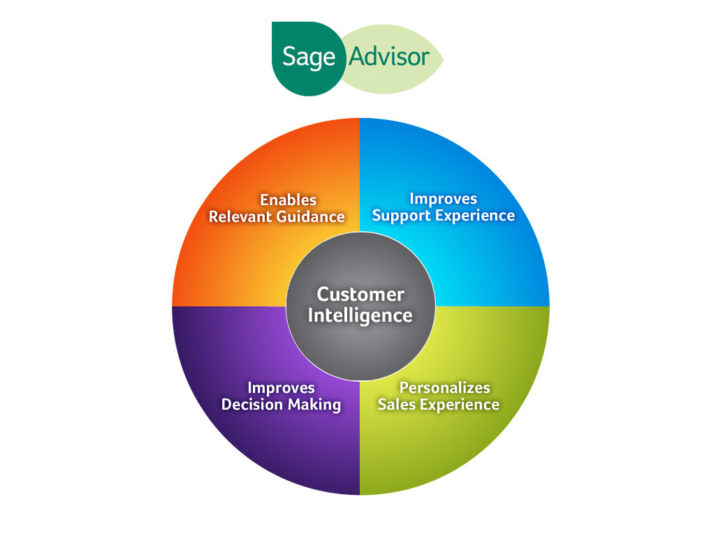
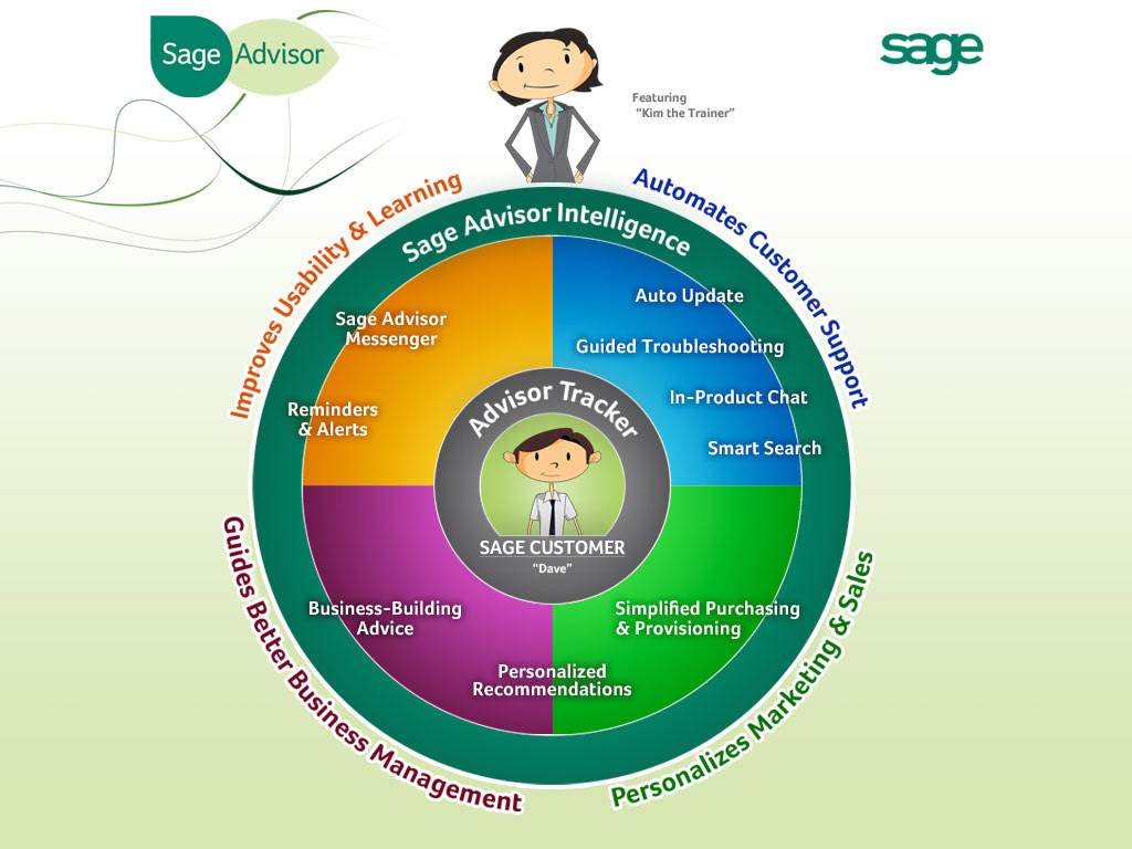
Below: I applied graphic styles and graphic elements to diagrams created by the director for explaining the strategy and components of Sage Advisor.

